Interview with Angie Lewin
This year we showed prints by Angie Lewin as part of our exhibition of works by The Royal Society of Painter-Printmakers and her prints generated lots of interest at our Ealing gallery. We’re delighted to be continuing to show Angie’s work as she is a leading light in the British printmaking world. Working in a range of printing techniques including linocut, wood engraving and screen prints Angie Lewin’s prints are inspired by both the clifftops and saltmarshes of the North Norfolk coast and the Scottish Highlands, as she depicts these contrasting environments and their native flora in intricate detail. As Angie Lewin’s work is relatively new to our gallery we caught up with her to find out more. Discover her work and inspiration for yourself in our Angie Lewin interview below.
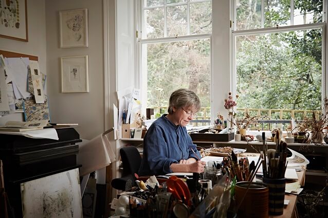
Can we start at the beginning? Where did you grow up and were you artistic as a child?
I grew up in a mill village near Macclesfield in Cheshire, bordering onto the Peak District. I drew a lot from a very young age and I believe that the way that you depict the world as an artist is very much influenced by childhood. From the age of about ten, a friend and I would go out for whole days in the summer holidays with sketchbooks and a picnic. We would walk miles across fields and along the canals drawing the wild flowers and wildlife.
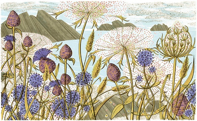
How did your career as a printmaker begin and where did you study?
I studied at The Central School of Art and Design. Initially I was on the sculpture course but in the first term we had to work in each of the printmaking departments. I hadn’t had the opportunity to do any printmaking at school or on foundation and, as soon as I set foot in the print studios, I realised that I wanted to spend all my time there. I was really attracted to the various processes, the presses, tools and even the smell of the inks. I was lucky enough to be able to change course, though I suspect the sculpture tutors might have been relieved to see me go!
Your work champions the underdogs of the floral world; dandelions, grasses and seed heads. What is about these plants that appeal?
I like to draw the plants that for me define the British landscape. By sitting down amongst the plants to draw I have discovered that the most insignificant plants can have the most fascinating and dramatic structures and forms. There are so many subtle variations within the same species. Often these plants struggle to survive in adverse conditions and this affects the way they grow. I find these qualities far more inspiring to study than more exotic plants growing in lush, fertile situations.
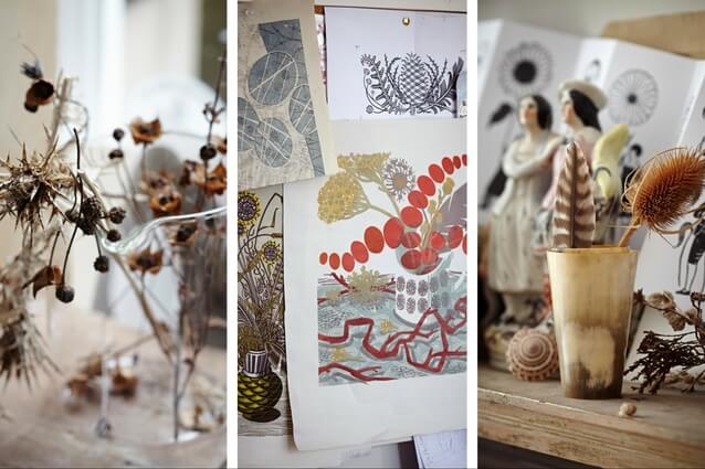
Since leaving London, you split your time between Norfolk and Scotland. What is it that you love about these places and does living in the countryside help make you more aware of the seasons?
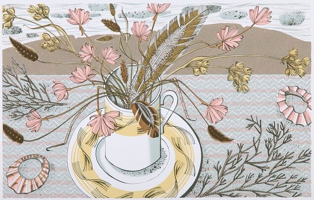
I’m certainly more aware of the seasons since I stopped living in London. The North Norfolk coast and Speyside and the Moray Firth in Northeast Scotland are the two parts of the UK where I’ve been spending most of my time for many years. They are contrasting landscapes and each have plants that for me define them. The alexanders, sea plantain, horned poppies and reeds are iconic Norfolk plants. Birch trees, wild valerian, devil’s bit scabious, yellow rattle, rowan berries and lichen sum up the Scottish landscape. I like these exposed landscapes and the way the conditions there affect the way that plants grow, such as thrift and sea plantain clinging onto rocky clifftops.
You have a very distinctive, recognisable colour palette. How do you come up with colour way ideas?
I make sketches, often with watercolour and pencil crayon, when I’m out walking. These, along with my familiarity with the colours of the plants in the different seasons, are the starting point for my colour palette when I’m printing. I love the chalky, understated colours of the British landscape. I’m also influenced by old natural history illustration such as the work of Paxton Chadwick and these colours often find their way into my work. However, I do find as each colour is printed this affects my decision about the next. This means the finished print can be sometimes very different to the original sketch, which is an aspect of the print process that I really enjoy. Ultimately, it is about trying to create the most successful print that I can.
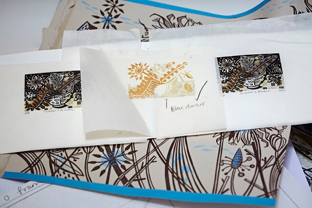
How important is your garden in your work or do you take your inspiration from the wider countryside? Are we unlikely to find any herbaceous borders in your garden?
Generally my work is inspired by the larger landscape, even though I depict plant forms in detail and just hint at the landscape beyond. But my garden does play a vital role as I grow structural plants that I enjoy drawing such as teasels, grasses, phlomis and artichoke. I also allow wild flowers and weeds to self-seed amongst the cultivated plants. I do grow a lot of herbaceous plants but there is a wildness to my flower beds.
You have a modern style with a nostalgic, almost 1950s, feel. What are your influences?
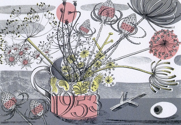
Artists that have influenced me over the years are Graham Sutherland, Alan Reynolds, Paul Nash and John Piper. Also Eric Ravilious and Edward Bawden. All the above, alongside painting and illustrating the landscape, produced commercial designs which were closely related to their personal work. This was at a time when this was seen as a valid source of income. This is a way that I’ve always like to work.
What is the starting point to a new work?
Each new print starts with the sketches that I make when I’m out walking or from the natural finds such as seed heads, feathers and pebbles that I take back to the studio to remind me of specific places.
Can you tell us a bit more about the techniques you use? Printmaking is a very time consuming process; can you explain how you work?
I work in all the print processes except intaglio: wood engraving, linocut, screenprint and lithography.
I develop my sketches into a full size colour drawing, which I then transfer either onto the block if doing a relief print or to use as a basis for the films I draw for screenprints or lithographs. Using this drawing as a starting point I then cut blocks or draw films for each colour.
You work across a range of printing techniques; do you have a favourite?
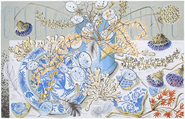
I enjoy the qualities inherent in each process. Sometimes if I’ve been doing a series of wood engravings I might feel the need to work larger for a while and so might make a large screenprint.
Do you have any particular tools that you like to use or paper preferences for printing on?
I’ve had many of my mushroom-handled lino and wood engraving tools since I was at college and so I am very attached to these. I prefer to block print onto Japanese papers as my transparent colours become part of the paper rather than sitting on the surface. When I’m working on screenprints or lithographs I like to use traditional lithograph crayons and also pen and ink to draw onto textured ‘True-grain’ film. I often print on Somerset paper.
We saw that you took part in the Big Steam Print project with Ditchling Museum of Art and Craft this summer. What were the challenges of creating a linoprint on such a large scale?
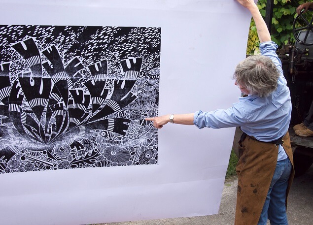
I’d not worked on such a large scale since I was at college. Once I’d scaled up my drawing it was important to get the weight of line right and also the balance of fine detail to dramatic areas of solid black. I always create multi-block prints so it was a challenge to work in just a single colour.
In addition to your prints and watercolours, you also run St. Jude’s, a textile company. Can you tell us how you moved into fabric and wallpaper design and the wider aims of St. Jude’s?
I’ve always enjoyed pattern making and also working in different processes and seeing my imagery applied in different ways. When I decided I’d like to produce some textile designs I liked the idea that, along with my husband, Simon, we could be in control of the entire process from the initial design and choosing colourways, working with fabric printers and marketing and selling the end product.
St. Jude’s was also set up to enable us to work with other artists and display the fabrics alongside their artwork and also furniture and ceramics that we like.
Do you see yourselves continuing the work of the likes of Edward Bawden and Eric Ravilious who championed the world of the applied arts?
I think there is a link with the way that Bawden and Ravilious worked. Also I’ve been influenced by companies such as David Whitehead and Edinburgh Weavers who in the past worked with artists such as Piper, Moore, etc, to create striking designs that closely relate to their paintings. I think it is important to have beautiful furnishings and domestic objects in our homes and that art should be seen in a domestic setting.
More about Angie Lewin
Angie Lewin is a well known British printmaker. Since graduating from Central St Martins in 1986, Angie has developed her unique style influenced by subsequent study of Horticulture and a love for the native plant life of North Norfolk and the Scottish Highlands. In 2006 Angie was elected to the Royal Society of Painter Printmakers and has exhibited widely in the UK and abroad. She has also completed commissions for Penguin, Picador and Conran Octopus and has designed fabrics for her own gallery St Jude’s and for Liberty’s Autumn Winter 2010 collection.
To see more of her prints click here.
For more insights into Angie Lewin’s work we’ve including links to a couple of films made about her and her work.


