Paul Catherall | London Transport Posters
London Transport Museum has one of the finest poster archives in the world. Since the early 20th century London Transport has commissioned work from the best artists and designers in the country and this tradition continues today. Paul Catherall’s prints feature beautifully reconstructed urban landscapes and architectural details and he has an expert eye for composition and colour so it’s no wonder that London Transport selected him to carry on their tradition of using artists to promote leisure travel around London.
We were intrigued about what it’s like working on such a high profile campaign so we caught up with him to find out all about it:
Can you tell us how you were approached to work with London Transport?
“I had actually posted samples to them in the past (in the pre email days!) but it was by pure chance that Mike Walton from London Transport Museum, who commissions the posters, saw an invite to an early show sitting on a colleagues desk. He came along, loved the prints and gave me my first commission a few months later. This was of Tate Modern, which had only relatively recently been transformed from the old Bankside Power station.”
How long have you been working with London Transport?
“The show mentioned above was in Spring 2001 and the commission came later in the year but the poster came out in 2003, so for 14 years.”
How did you feel about continuing this great catalogue of poster design history?
“I felt completely honoured and was over the moon! At college the commissions that you dreamed of were stamps for Royal Mail and posters for London Transport – they were like the FA cup and Champions league of illustration. Most of my design heroes like Edward McKnight Kauffer, Tom Purvis and Tom Eckersley had produced posters so it was a proud moment to be continuing this tradition.”

How are the images chosen? There seems to be a mixture of destinations but also a celebration of the vehicles themselves e.g. the new Routemaster.
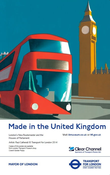
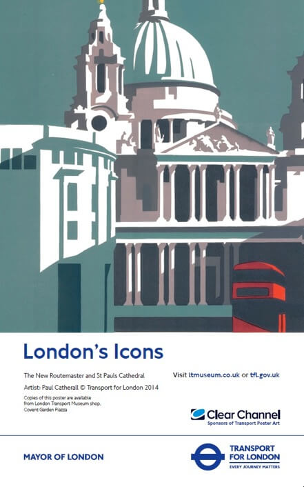
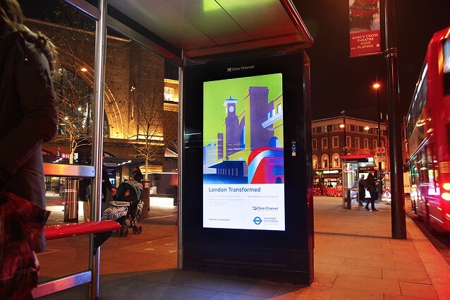
“The idea was to show the gradual integration of the new Routemasters into the fabric of London life, whilst celebrating the striking design of the bus. They also give a platform to the iconic landmarks of London from the grand classics of St Paul’s and Big Ben to the recently ‘uncovered’ Kings Cross and the new ‘Cheesegrater’ (Leadenhall Building) on the final print. The scale of the bus diminishes with each print (Big Ben was first) to symbolise its integration.”
Are there any restrictions in choice of design?
“The Landmarks were pretty much chosen by LTM and the idea was also to display the seasons through colour palette. Big Ben is Summer, Kings cross Autumn, St Paul’s Winter and the Cheesegrater is to be Spring.”
 Can you tell us a bit about your most recent prints?
“The Routemaster set kept me busy pretty much the whole of last year – the edition number on each is 40 and I hand print every one. Other prints have been a smaller version of an old classic of mine – ‘Battersea Slate’ (I’ve printed this view of the old power station, showing two chimneys numerous times always newly cut and either a different scale or colour way) and ‘A Vision’ which was an illustration to a Simon Armitage poem commissioned by Faber.
I’m currently working on images of the Lloyds building and a New York cityscape for a Lloyds syndicate. Future plans are prints of the old Penguin Pool at London Zoo, the former Commonwealth institute (being renovated as the new home for the Design Museum).”

What is the print process for the posters?
“The prints are all hand carved and printed linocuts. I begin by gathering reference – usually photos and sketching, if time will allow. Then I spends days drawing and refining the composition on layout paper. This is really where the hard work is, because to me composition is everything. It can take an entire day just to eventually decide to crop 5mm into the side…..!
I usually do a small colour painting just to test out the colours I have in mind – sometimes this can lead to a few variations. Then when happy, the drawing is enlarged to the size of the actual lino and the ‘master’ drawing is done. Everything comes from this master – so will always trace onto the lino from here and use this drawing to work out my registration on the press.
Each colour outline is traced onto the lino and carved – leaving only the areas to be printed. I usually have a separate block for each colour but can have two or three colours per block if it’s complex. Then the colours are usually printed from dark to light, colour by colour and drying overnight. It can take two or three days just to print one colour if the edition number and scale is large.”
How many images have you produced?
“I honestly don’t know how many different images I’ve created – easily over a hundred. I’ve been doing it pretty much solidly since 1999. By the time I’ve finished the last one of this New Routemasters set I will have done 17 for LTM, which I almost find it hard to believe!”
Poster art can enhance the journey of millions of passengers, by bringing great art onto the transport network. Do you know where can we see your prints?
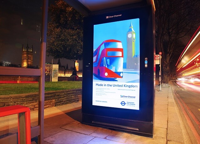
“The posters are at various bus stops and on around 200 sites on the Underground – they are permanent sites set up by Clear Channel who sponsor the poster art. Not sure how long they’ll be there but went up in late January and are still up at time of writing.”
Paul Catherall is a London-based printmaker and illustrator. He has become renowned for his clean, sharp linocuts of architectural landmarks, exhibiting at numerous solo and group shows, as well as his figurative illustrations for high-profile clients. Paul will be exhibiting with For Arts Sake from Friday 17th April to Sunday 17th May and we’re pleased to announce that the exhibition will include some of his London Transport prints, giving you a chance to see them upclose.


